Connect with The Civic Digest
Join our mission in shaping informed civic dialogue
Get in Touch with Us
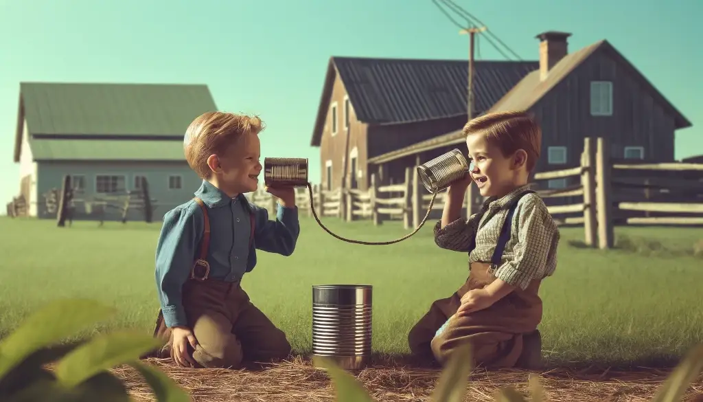
The Goofy History of the Contact Page.
The Stone Age of the Internet
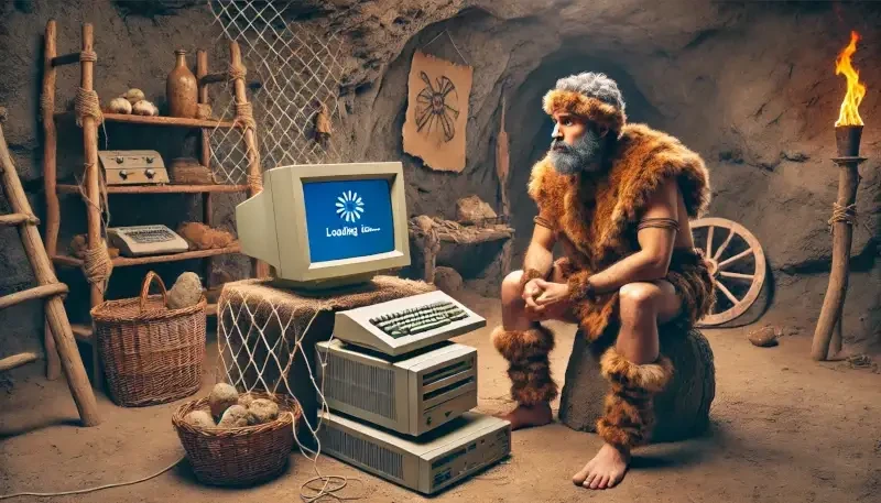
Picture this: It's the early 1990s. The internet is like a newborn baby, barely able to hold its head up. Websites are basically walls of text with a few ugly images sprinkled in for good measure. The concept of a contact page is simple: slap an email address or phone number on the site and call it a day. No frills, no thrills—just a straight-up invitation to get in touch, if you can figure out how to use your dial-up modem, that is.
The Dawn of Forms
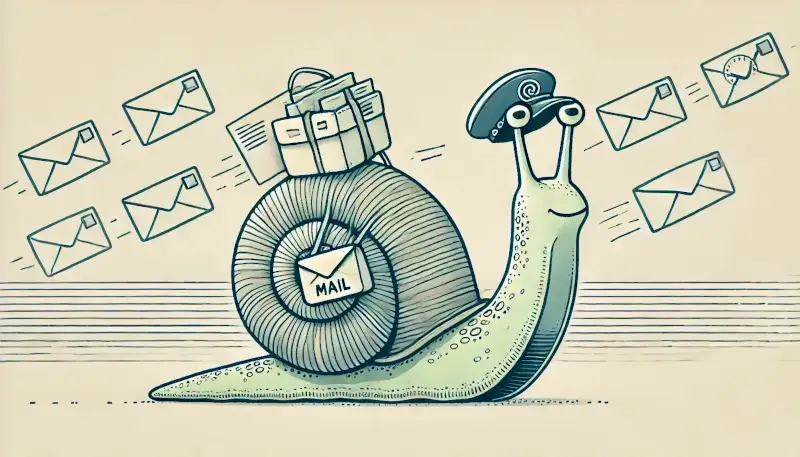
By the mid-90s, people started getting fancy with HTML forms. Instead of hunting for an email address, you could fill out a form right there on the website! Revolutionary! Users could now enter their name, email, subject, and message into a neat little box. It was like sending a letter without needing a stamp. Website owners rejoiced at the newfound organization, while users were thrilled to avoid the hassle of opening their email client.
The Spamocalypse
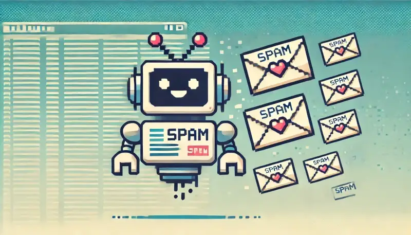
Of course, with great forms came great spam. Automated bots discovered they could send spammy messages to every website with a form. Enter CAPTCHA, the hero we needed but didn't deserve. Now, you had to prove you were human by deciphering distorted text that looked like it was written by a drunk robot. Frustrating? Yes. Effective? Also yes. The contact page was now a fortress against the evil spam bots.
Design Matters, People!
Fast forward to the mid-2000s, and web design starts to matter. Contact pages got a makeover. No more plain text and basic forms. We got clean layouts, intuitive designs, and clear calls to action. You could find office addresses, maps, and business hours all in one place. The contact page was growing up, becoming the sophisticated liaison between user and business.
Getting Social
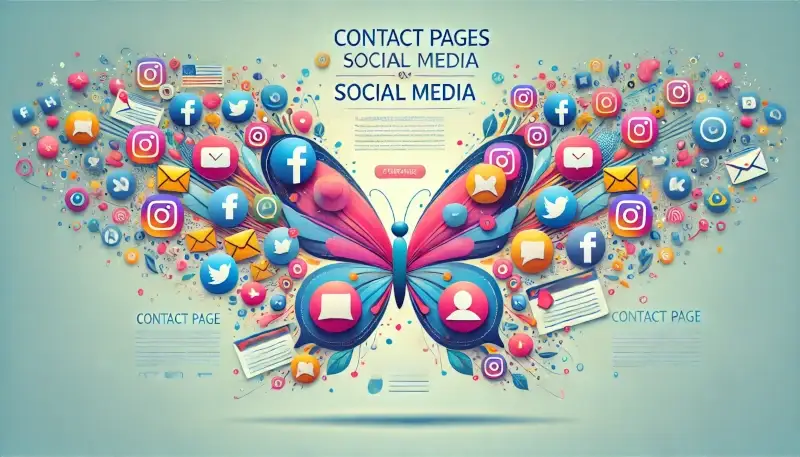
Then came the social media explosion. Suddenly, it wasn't enough to just have a contact form. You had to be reachable on Facebook, Twitter, LinkedIn, and every other social platform. Contact pages started to sport social media buttons like flair on a barista's apron. Businesses wanted you to like, tweet, and follow them all over the web. It was the social butterfly era of the contact page.
Mobile Mania
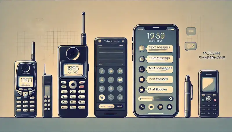
As smartphones invaded our lives, websites had to adapt. Enter responsive design. Contact pages now had to look good and work well on screens the size of a postcard. Buttons got bigger, forms got simpler, and you could tap to call without needing a magnifying glass to hit the right link. The contact page was now a mobile-friendly powerhouse.
High-Tech Shenanigans
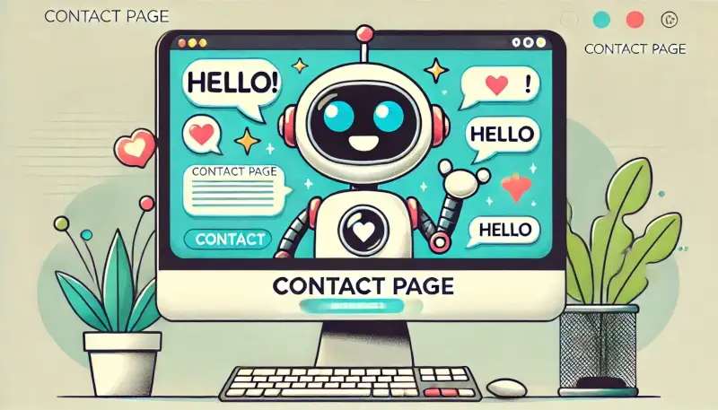
Today, contact pages are more advanced than ever. Got a question? A chatbot pops up, ready to assist. Need to book an appointment? Do it right there on the page. Contact pages have become customer service hubs, thanks to AI and other fancy technologies. They're like the Swiss Army knives of the web, ready to handle any task you throw at them.
Privacy, Please
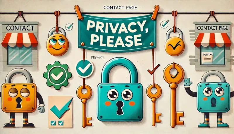
In our age of digital paranoia, security and privacy are top priorities. Modern contact pages assure you that your data won't be sold to the highest bidder ❲ Wink, Wink... ❳. Privacy notices and opt-in checkboxes are the norm, making sure your info is handled with care. Trust is key, and contact pages are the front line in building it.
The Future Awaits
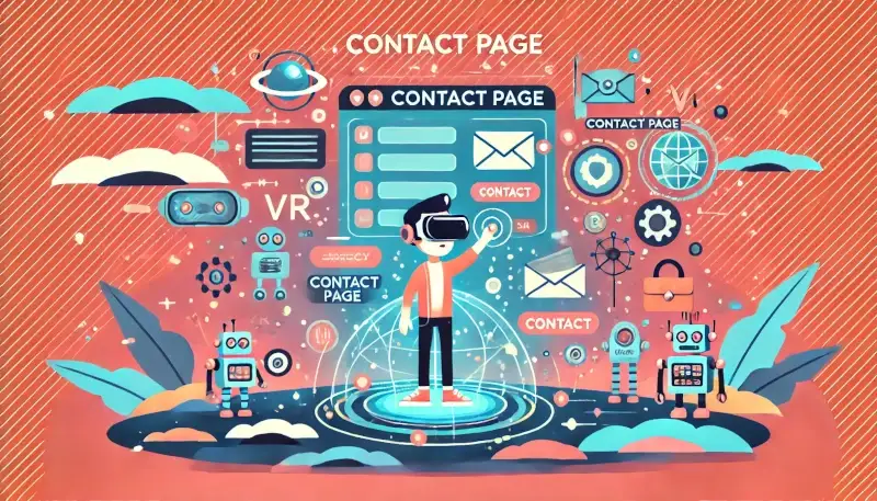
From humble beginnings to high-tech hubs, the contact page has come a long way. It's evolved alongside the internet, adapting to new technologies and user needs. Whether you're sending a compliment, a complaint, or just saying hello, the contact page is your go-to gateway for making connections in the digital world. Who knows what the future holds? Maybe holographic customer service reps or telepathic chatbots. Whatever it is, you can bet the contact page will be there, ready to bridge the gap between humans and the virtual world.